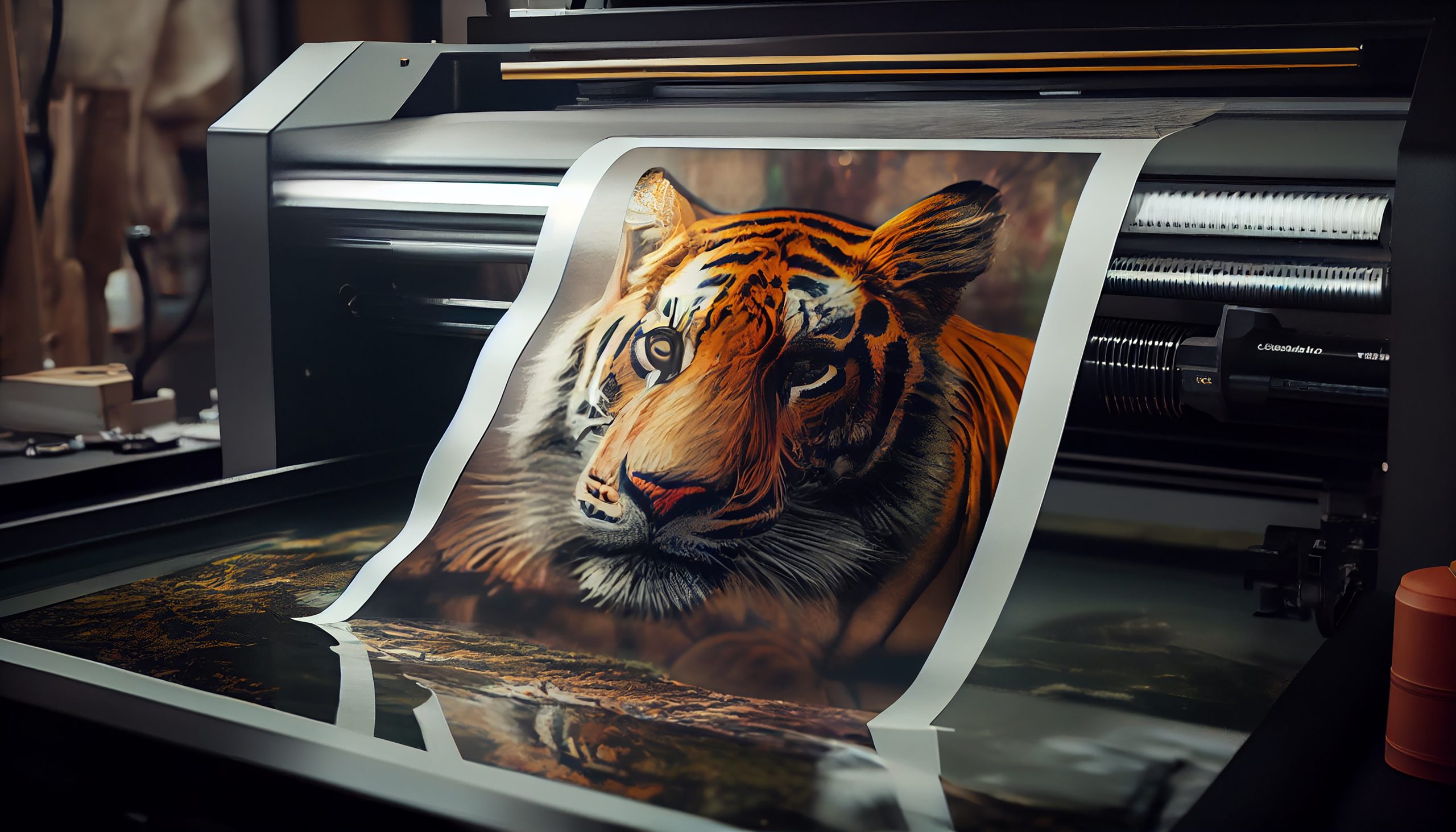
🎨 Design That Looks Good But Says Nothing? Just Expensive Wallpaper.
You’ve probably seen them. Brands that look amazing — color palettes on point, beautiful layouts, typography that screams “premium.”
But then, you try to figure out what they actually stand for… and you’re left wondering, “Wait — what do they even do?”
This is more common than people admit. Because here’s the truth: a lot of design today is aesthetic-first, meaning-second. It looks good, yes. But it doesn’t say anything. It doesn’t move anyone. It doesn’t stick.
And that’s not just a design flaw. That’s a brand clarity breakdown.
The Silent Killer of Brand Connection
At Sophistec Studio, we work with founders and creative teams who come to us saying: “Our visuals look nice… but it doesn’t feel like us anymore.”
That disconnect isn’t just a vibe. It’s a signal. A signal that your design system isn’t connected to your identity system. Your team may be pushing out content, but your story? Your purpose? It’s getting lost in translation.
And it’s costing you.
According to Lucidpress’s 2024 Brand Consistency Report, 68% of companies admit their visual identity doesn’t reflect their mission or customer journey. Even worse — inconsistent branding can shrink revenue by up to 23%.
So yeah. “Making things look good” is not the goal. The goal is to make things true, coherent, and compelling.
The Myth: “We’ll Figure Out the Strategy Later”
Here’s a phrase we’ve heard too many times: “Just design something clean and premium. We’ll work on the messaging later.”
Spoiler: Later almost never happens. And visuals that aren’t grounded in story tend to float away fast — forgettable at best, off-brand at worst.
What you need isn’t just design. You need a system. A way to translate your why into something your audience can feel in 3 seconds or less.
That’s why at Sophistec Studio, we don’t just deliver one-off assets. We build what we call Visual Identity Ecosystems™ — a framework where design, storytelling, and strategy work together seamlessly.
What Strategic Design Actually Looks Like
We start by asking the hard (but necessary) questions:
- What do you stand for — really?
- What shift are you trying to create in your industry?
- How do you want people to feel when they encounter your brand?
Then we translate that into:
- 🎯 Brand archetype-driven layouts
- ✍️ Message-first typographic rhythm
- 🎨 Emotionally intelligent color systems
- 📐 Modular, scalable asset libraries
Because design should reflect identity. Not trends. It should evolve with your brand — not trap it in a static “vibe.”
Case Study: From “Minimal” to “Memorable”
One of our clients, a rising wellness tech startup, came to us with a brand identity that was clean, sleek… and entirely forgettable.
Everything about it looked “safe.” Muted colors. Soft fonts. Generic visuals.
So we helped them reconnect with their actual story — one centered on empathy, transformation, and everyday empowerment.
We refined their design grid, restructured their messaging hierarchy, and rebuilt their visuals around warmth, clarity, and realness.
The results?
- 75% longer average website dwell time
- 40% lower bounce rate
- And best of all, a brand that felt like home to their team and audience again
So… Is Your Brand Saying Something or Just Looking Pretty?
Here’s a question worth asking: If your audience muted the sound and just looked at your visuals — would they get you?
If not, it’s time to rethink the system behind your surface.
Design that performs is design that speaks. That aligns. That carries your voice.
And if your design isn’t doing that, it might be time to stop decorating and start directing.
Let’s build something deeper than pretty. Let’s design your brand’s visual voice — and make it unforgettable.
📩 Explore our Visual Identity Ecosystems Or book a discovery call at Sophistec Studio
Sophistec Studio
Innovate. Create. Inspire.
Based in Indonesia
Serving Clients Worldwide
🌐 www.studio.sophistec.global
📩 management@sophistec.global
📞 +886 971 698 284 (TW) | +62 851 7301 9500 (ID)


